
“So is my conversion rate good?”
The question that every client likes to ask. A slightly misleading one of course, as you are never comparing apples with apples. Is a conversion rate of 20% for a 5 page mortgage form better than 50% for the lead generation form that got the customer there in the first place? Impossible to answer to be sure, but it doesn’t stop us, as form experts, being asked the question every day.
We generally don’t like to answer these questions specifically as the only benchmarking you should really be doing is against yourself – is the form performing better than it did last week / month / year?
However, we eventually relented. After years of dealing with such requests, we pulled together data from across the thousands of forms that we analyse, and aggregated them into one central benchmarking repository allowing clients to finally answer their own question.
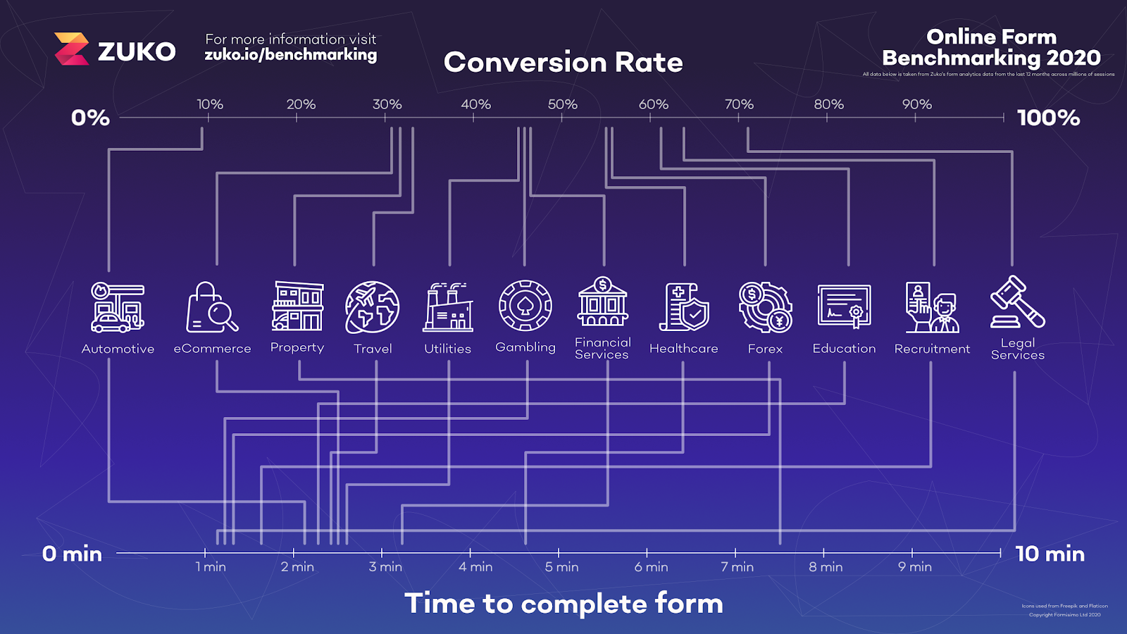
Today’s blog, however, is not about what conversion rate you should expect from your form (the data is open source so you can check it out yourself), although we have given you a titbit in the below infographic. Instead, we thought we would pull out some of the more interesting, and surprising things we found as part of the study.
The number of form fields has no effect on conversion rate
Right. Let’s start with the biggest, and most counter-intuitive, finding.
Everyone, ourselves included, has been going round telling businesses to cut down on the number of fields if you want to improve conversion.
We were wrong.
The data below plots the number of form fields against the conversion rate. The trend line is almost flat meaning it is not a significant factor (overall) driving abandonment.
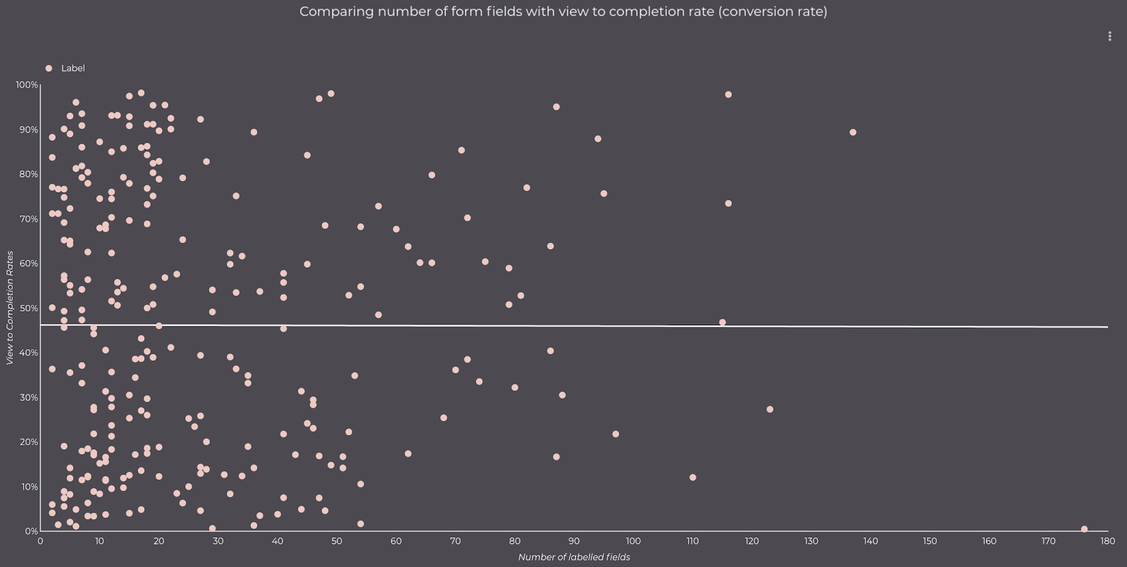
Does this mean that we’ll be telling everyone it is OK to add as many fields as they like to to their form? Of course not. But it does demonstrate that there are many more important things influencing form conversion rates than the length of the form.
Local government forms are looooooooong
This may come as no surprise to anyone who has had to complete a local tax refund form but, of all the sectors we looked at, the government sector had the largest number of inputs required to get to completion. On average you would have to fill in 71 pieces of information before submitting. This compares to the relatively sprightly automotive sector which typically only requires 8 inputs.
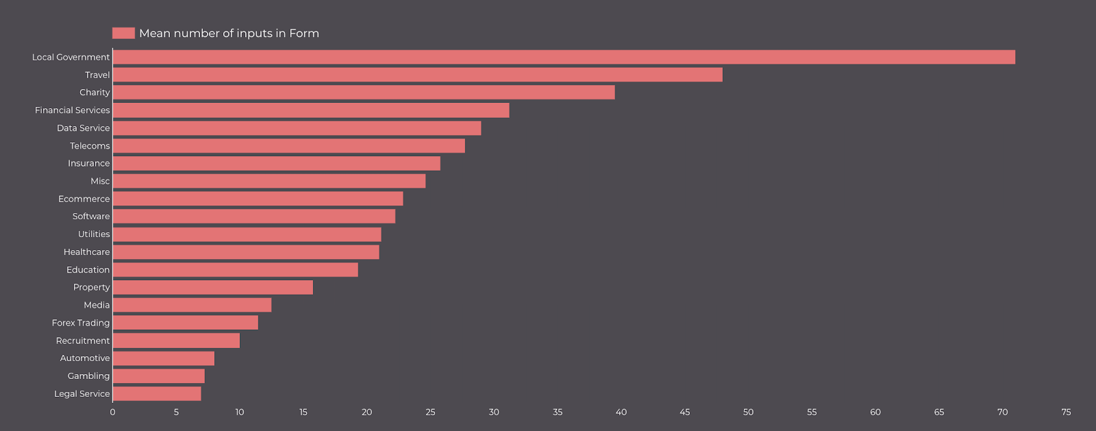
Interestingly enough, and related to insight (1) above, despite all this time needed to complete (eight and a half minutes on average), these forms have a staggeringly high completion rate (85%!). The slinky automotive forms would be happy with that – they have a completion rate of just 10%.
The moral of this story? Self selection. Perhaps only the most cussed, determined, foolhardy adventurers even attempt to fill out a 20 page local government application but, once they start, they will be damned if they give up. The rest of us are happy never even trying!
Mobile is catching up with desktop
47% of users viewing a desktop form converted successfully compared to 43% for mobile devices. While this is still a significant difference it is much lower than our previous data showed which implies that the years of conversion pro’s insisting that customer journeys be optimized for mobile has started to take effect.
Converting users return to fields more often than those that abandon
It has long been a point of debate in the form analytics community. If a user returns to a form field a lot, does that indicate that they are getting frustrated and will abandon or does it mean that they are a determined buyer and will get it right in the end?
Our topline data indicates that it is the latter. Average field returns are higher for completed sessions than abandoned sessions (5.6 returns v 4.5) showing that a level of determination is a driver to get users through the more difficult types of form.
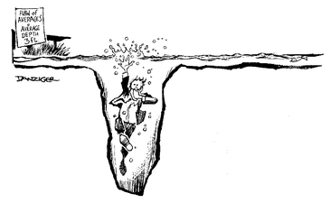
Is this the end of the argument? Certainly not. The flaw of averages comes into play. If there is a long tail of abandoners who drop off immediately but a significant cohort who spend ages trying to complete the form before dropping off in frustration then this conclusion is not correct.
We are mining the data further but the findings are a story for another blog!
Almost 95% of people who start insurance forms complete them
People really want to complete insurance forms. Or, at least that’s what our data shows. Starting a long insurance form is not for the faint hearted and is obviously a considered decision. These applications are often split into several forms over many different steps and URLs. What this means is that each step has a very high completion rate, with customers dropping out gradually over the course of a journey. From our experience, insurance forms are also some of the best designed given how important they are for insurance businesses. This means that often they avoid some of the common pitfalls of other types of form, and this is reflected in their completion rates.
Either that or trolling insurance companies with fake applications is a new hobby we haven’t heard about yet.
Registration forms cause a lot of frustration
People really want to get their details right! Surprisingly, registration forms have the highest number of field returns, meaning that someone has entered their information but has had to go back to correct it later. On average, users of registration forms return to fields 13 times during the course of a successful completion. This compares to 2.6 returns for the average purchase form or even 3.8 for comparison forms.
This may be in part caution on behalf of users wanting to ensure they can log in when they return, but the key driver is Pa$$w0rds. Registration forms often have password fields which have stringent requirements and restrictions on what can and can’t be picked. We’ve all had the frustration of trying to set a password only to be told you need to enter capitals, numbers, special characters + uncle Tom Cobley and all. What’s worse is when the error messages don’t even tell you what you are doing wrong.
While this is to some degree inevitable, there are still a lot of bad forms out there. We generally see multiple field returns to password fields for a large percentage of users filling out a registration form which could be solved if the form builders involved only followed best practice.
Contact forms are the runt of the form litter
Despite, in theory, being one of the easiest form types to complete (how difficult is it to enter your name and email address?), under 10% of people that see a contact form end up submitting it.
Why is this? Contact forms often sit on pages with a lot of information on, and can be sat at the bottom of the page, out of sight. Nevertheless, it’s quite a surprise to see such a small rate – the lowest of any type of form that Zuko has tracked.
Even accounting for the “out of sight, out of mind” issue, contact forms do not perform well. Of those who take the time to start the form, only 38% end up successfully completing. Again, this is the lowest performing form type in Zuko’s benchmarks, comparing unfavourably with application forms (75% of starters complete) and registration forms (63%).
What kind of a world do we live in where people will hand over credit card details and sensitive medical information willy nilly but ask them to fill out a contact form and they are gone before you can say “Pleaseticktheboxtoagreetoourtermsandconditions”!
A third of users who start to fill in a form end up abandoning
Users who actually interact with a form (as opposed to having a quick scan before heading elsewhere) are the red hot prospects for any conversion guru. Yet 34% of people who start to fill in a form, often giving their sensitive personal information, do not finish it. That’s a third of the potential money left on the table.
While this is probably not a surprise to any digital marker, it does show there is always room for improvement and a demand for the services of a good analytics platform or conversion rate professional to make things better.
Every cloud has a silver lining, eh?